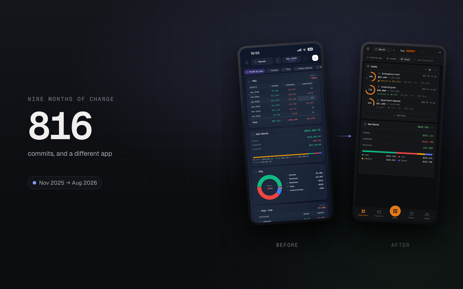
It began as a dashboard. One screen, a handful of widgets, and a stubborn conviction that most finance apps answer the wrong question — they tell you what you spent, when what you want to know is where you stand.
That first commit landed on 6 November 2025. Nine months and 816 commits later there are twenty-one mini-apps, five live bank connections, an iPhone and Android app, and about 229,000 lines behind it. This is the honest version of how that happened, including the parts we got wrong first.
Month one: a dashboard, and not much else
November was foundations. A dashboard shell, a Profit & Loss widget, asset metrics, an accounts view. You could see numbers. You could not really do anything with them.
The decision that mattered most was made quietly that month: widgets would be configurable, and the dashboard would be a grid the user arranges rather than a layout we hand down. That cost more than a fixed screen. It is the reason there are now boards for profit and loss, for allocation, and for whatever else someone decides to build — instead of one opinionated view everybody has to live inside.
Then: making it yours
December and January went on the consequences. Hidden accounts, so a dormant card stops skewing the totals. Click-to-filter, so a slice of a chart takes you to the rows behind it. A net-worth widget with a liquidity breakdown, because "how much do I have" and "how much can I reach this week" are different questions.
By the end of January the dashboard could be shaped. That is when its shape started arguing for the rest of the product.
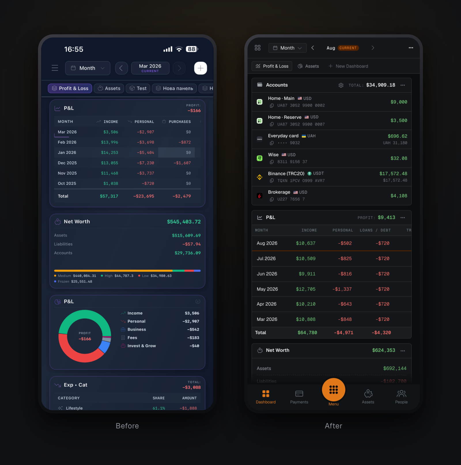
Structurally it is the same screen nine months later. What went is the decoration: widget chrome got quieter, figures moved to a monospaced face so columns line up, and the period control moved into the header instead of floating above the grid.
February: the empty-screen problem
Wizards arrived — liabilities, purchases, personal items — and with them a problem we had been ignoring. A finance app with no data in it is useless, and getting data in is the least enjoyable thing anyone will ever do with it.
February also began the internationalisation work, and on the 22nd the first commit landed in a second repository: the iOS shell.
March and April: teaching, not documenting
These were the two heaviest months in the project's history — 179 and 206 commits. Almost all of it went to onboarding.
Not documentation. Tours that run inside the product, on your own space, with the wizard open in front of you. The bet was that nobody reads a help page before their first transaction, and that a feature nobody can find has not shipped.
April also brought unified asset detail panels with real charts, and company enrichment that fills in a client's details from their website instead of leaving you to type them.
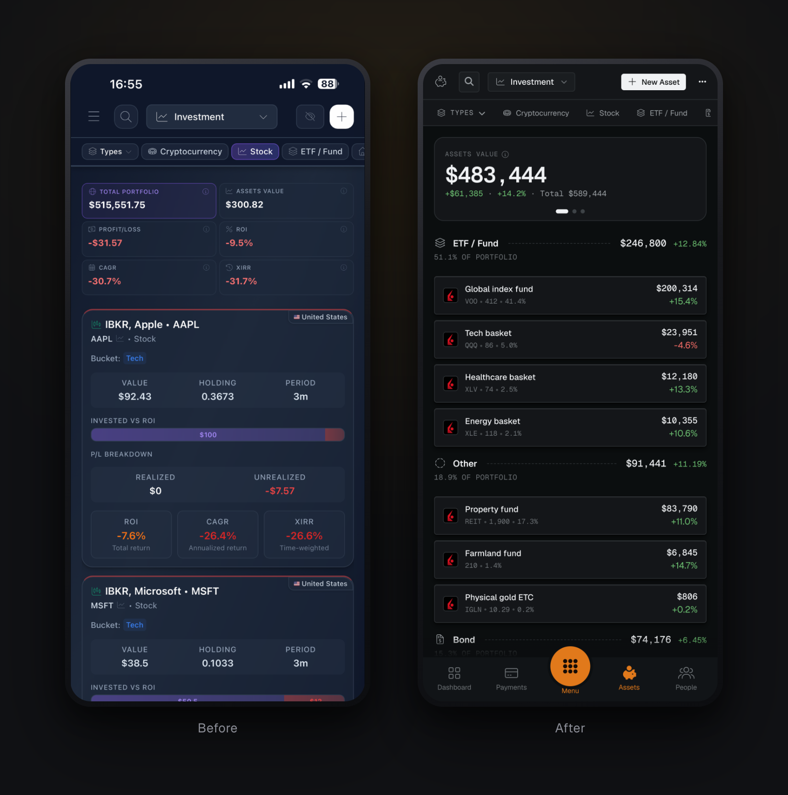
Investments went the way you might not expect — from cards each carrying six metrics to a list carrying one line per holding, with the analysis moved to its own board. The old screen answered "how is this asset doing" six times over. The new one answers "how is the portfolio doing" once, and opens a holding for the rest.
May: the redesign
One commit in May is simply feat: redesign.
Transactions were rebuilt around a database-style table.
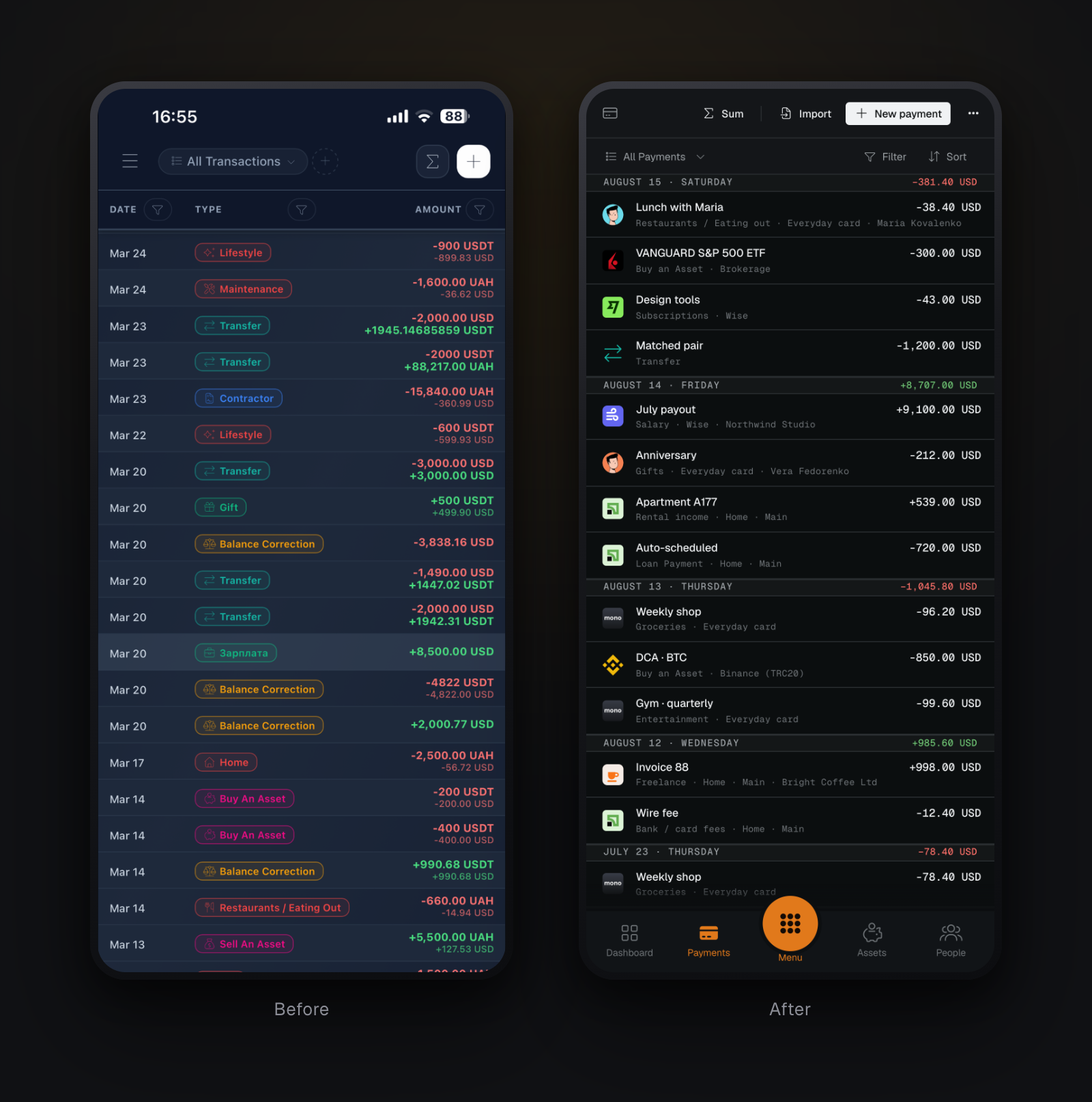
The ledger is the clearest case in the whole redesign. The old row told you a date, a type and an amount. The new one adds the icon, the category, the account the money moved through and who was on the other side — and groups by day with a running subtotal. The data underneath did not change. What changed is how much of it the row is willing to say.
Portfolio metrics got explainers with infographics too, because ROI, CAGR and XIRR are three different numbers that disagree with each other for good reasons — and a figure nobody trusts is worse than no figure at all.
June: money owed, and work done
Invoices landed as a proper accounts-receivable layer: invoices, allocations, adjustments, attachments. The distinction that took longest to get right is that an invoice is an obligation and a pending transaction is a movement. Conflating them makes both wrong.
Projects grew contributors and payments. Time logging arrived and joined the two: hours booked against a project become labour cost, labour cost against billing becomes margin. "Is this client actually profitable?" got an answer that comes out of the data rather than a spreadsheet.
July: letting the bank do the typing
Back to February's problem, with the answer we had been building toward: live connections. PrivatBank AutoClient, IBKR Flex, Binance, monobank, Wise. Authorise once, pull fresh payments whenever you want them, no file to download.
For everything else there is still statement import — now with duplicate detection that catches a row you already booked by hand.
August: into your pocket
The mobile apps got their own navigation: a footer bar holding your four most-used apps around a centre menu, replacing a drawer that never suited a thumb. Push notifications went out over direct APNs and FCM with no vendor in between. Imports learned to run on a schedule.
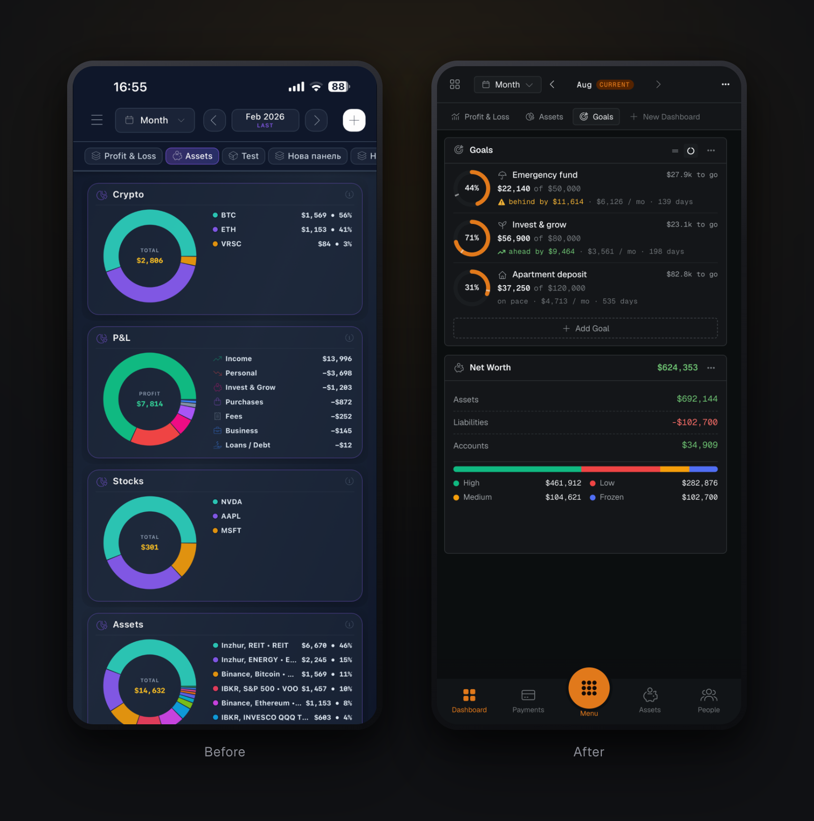
That last pair is the one that shows the navigation change, and it is the change that most affected how the app feels one-handed — the one we took longest to admit was necessary.
The marketing site got a live preview that is not a mockup — it embeds the real application running against a fixture. Same components, same styles. When the product changes the site changes with it, because there is nothing separate to keep in sync.
What nine months taught us
Configurable beats opinionated, if you can afford it. The grid was more work than a fixed dashboard. It is also why the same app fits a freelancer, a family and a small studio without being three products.
The hard part is not features, it is the first hour. Two of the busiest months went to onboarding rather than functionality. We would spend them the same way again.
Numbers have to agree with each other. A net-worth figure that disagrees with the accounts beneath it costs more trust than a missing feature ever will. Much of the invisible work is arithmetic that reconciles.
Ship the boring parts first. Multi-currency, audit trails, duplicate detection. Nobody chooses an app for them. Everybody leaves over them.
Where it is going
Deeper bank coverage, richer reporting, and continued work on the throughline since February: shortening the gap between "my financial data exists somewhere" and "I can see where I stand".
Nine months in, the dashboard is still the first screen. It just answers a great deal more now.
See your own number instead of reading about someone else’s.
Import a statement, add your accounts, and get a real net-worth figure in an evening. One month free, no card required.
Start free